2024
Learn everywhere
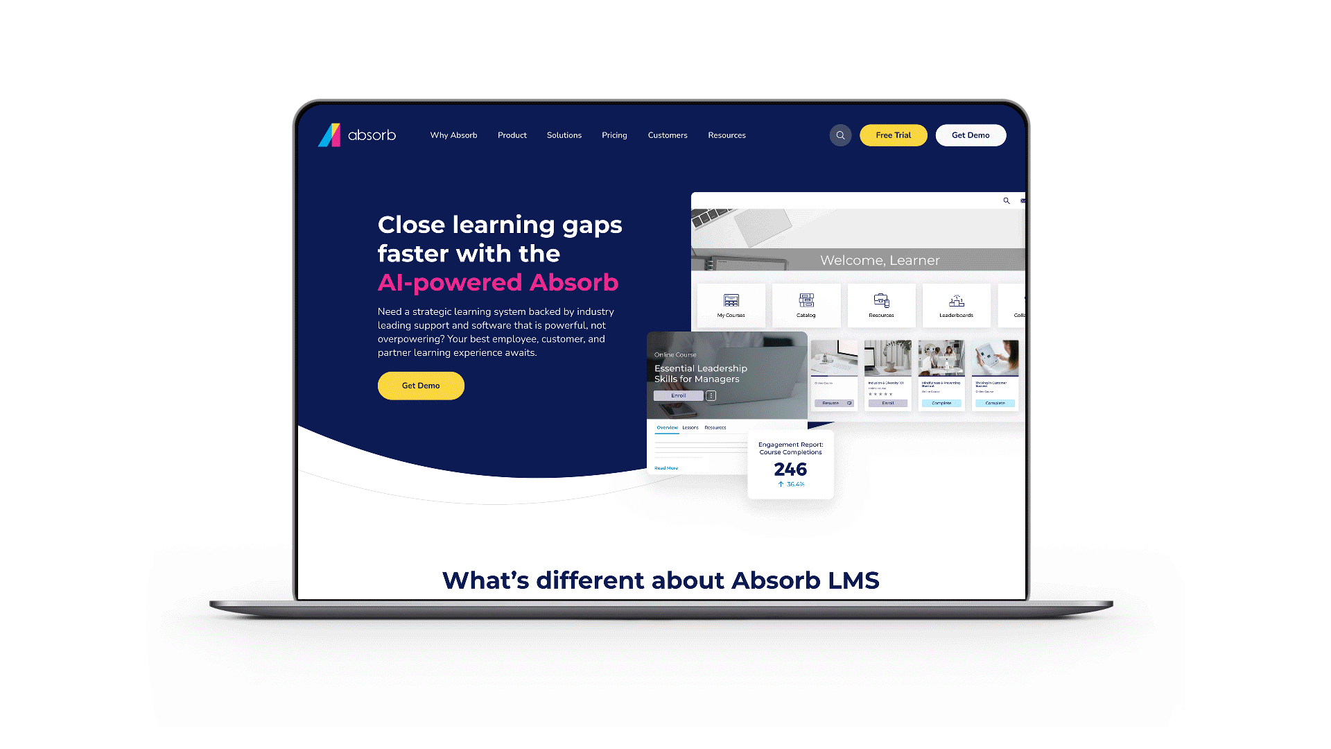
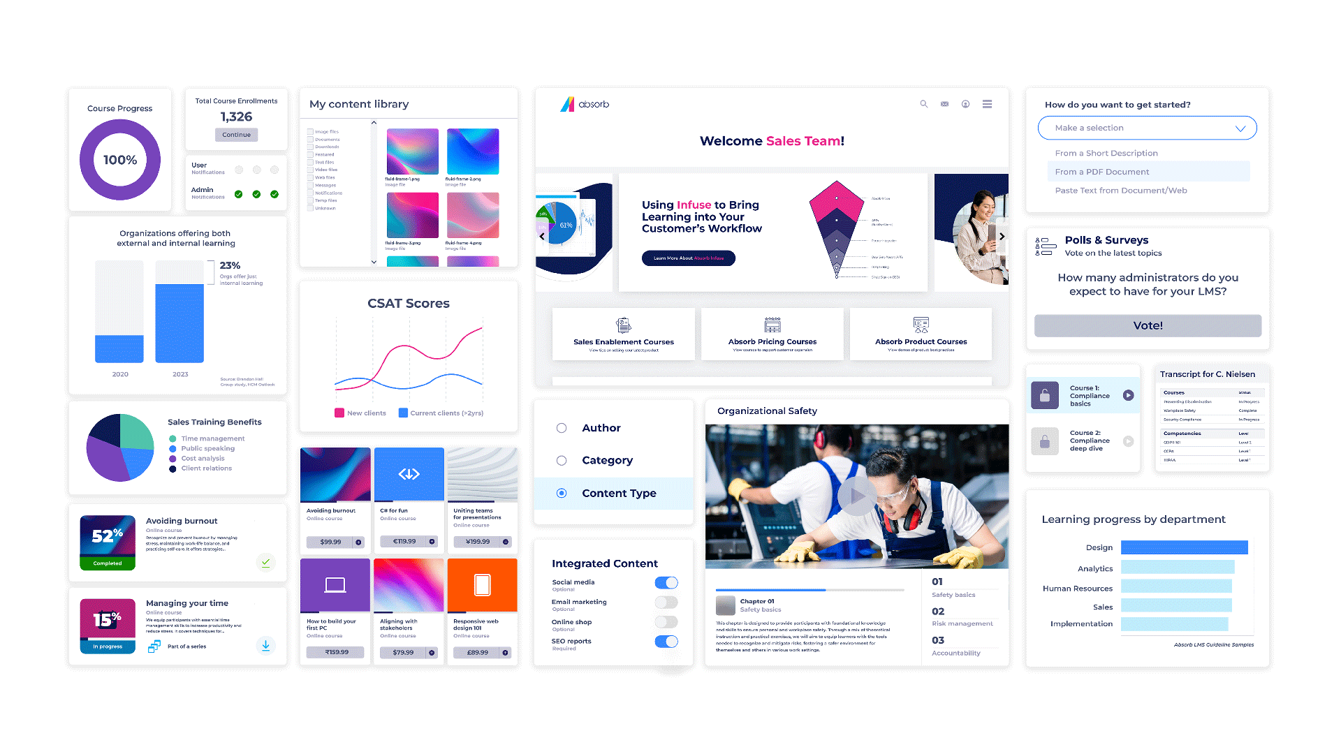
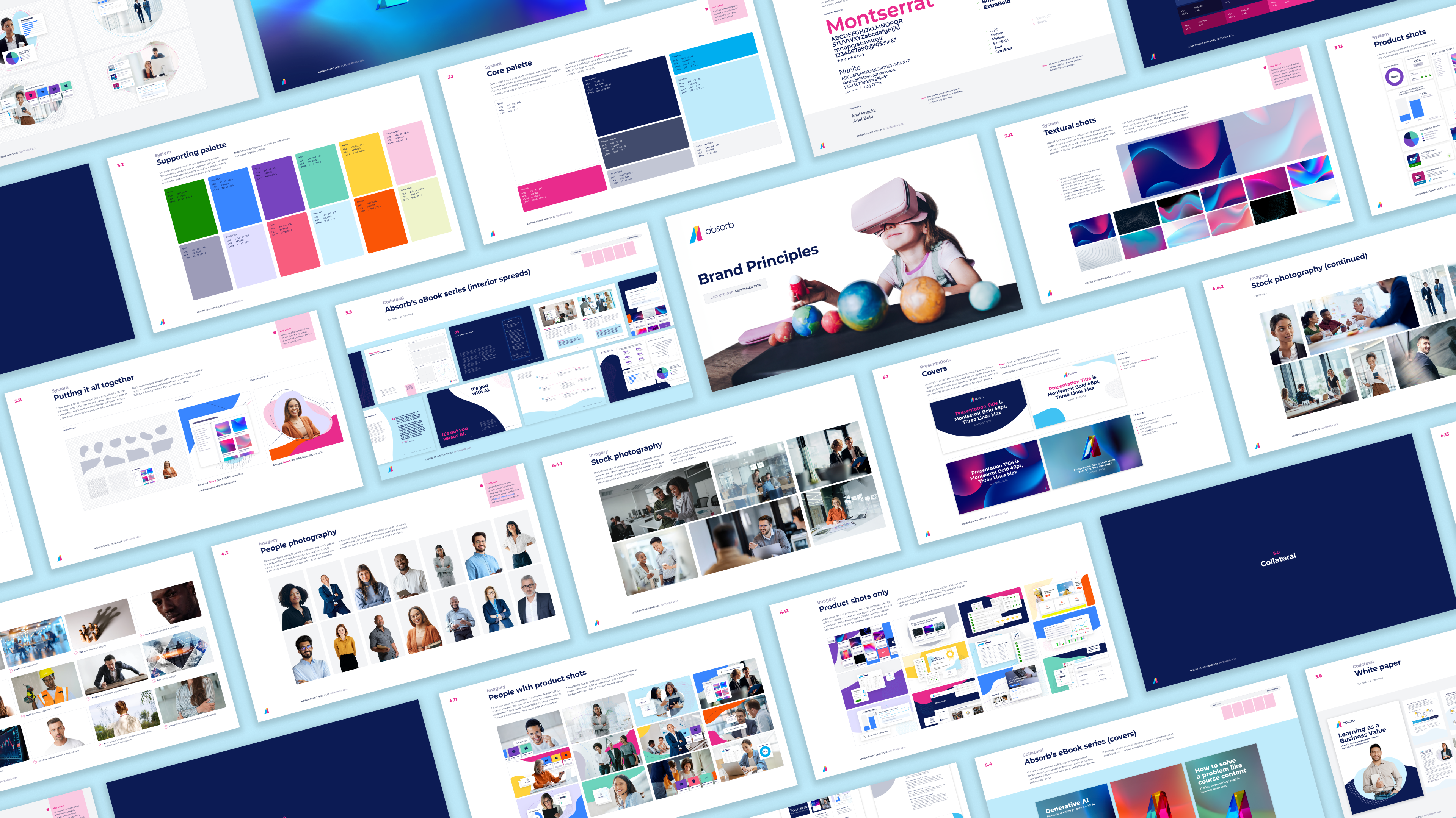
Absorb’s Learning Management System (or LMS) is for enterprises and organizations across all industries to train employees, customers, partners, and members anywhere in the world. By reflecting Absorb’s customer-service-led reputation, we pushed the brand to embrace bright, clean, and friendly design patterns.
Absorb’s evolving look has unveiled an eLearning company looking more “grown up” and ready to keep scaling. 🚀
company: absorb software (in-house)
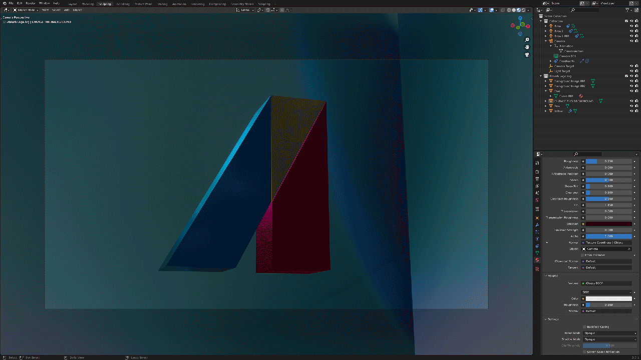
Role: design, direction, motion, ui/ux/ix, qa, packaging, print
website: https://www.absorblms.com/
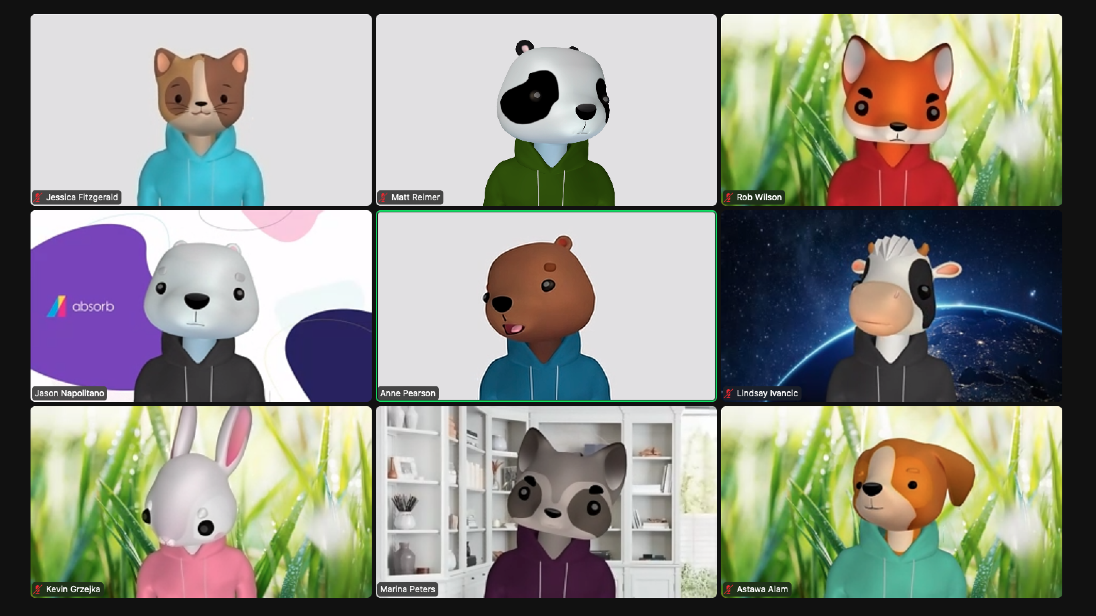
direction: jason napolitano
design: rob wilson, priscilla lobiondo
motion: matt reimer, rob dickson, maksym tsylia
research: anne pearson, poorvi joebert
writing: sophie furnival, lindsay ivancic
programming: jim o’harra sutton, chad augur


2024
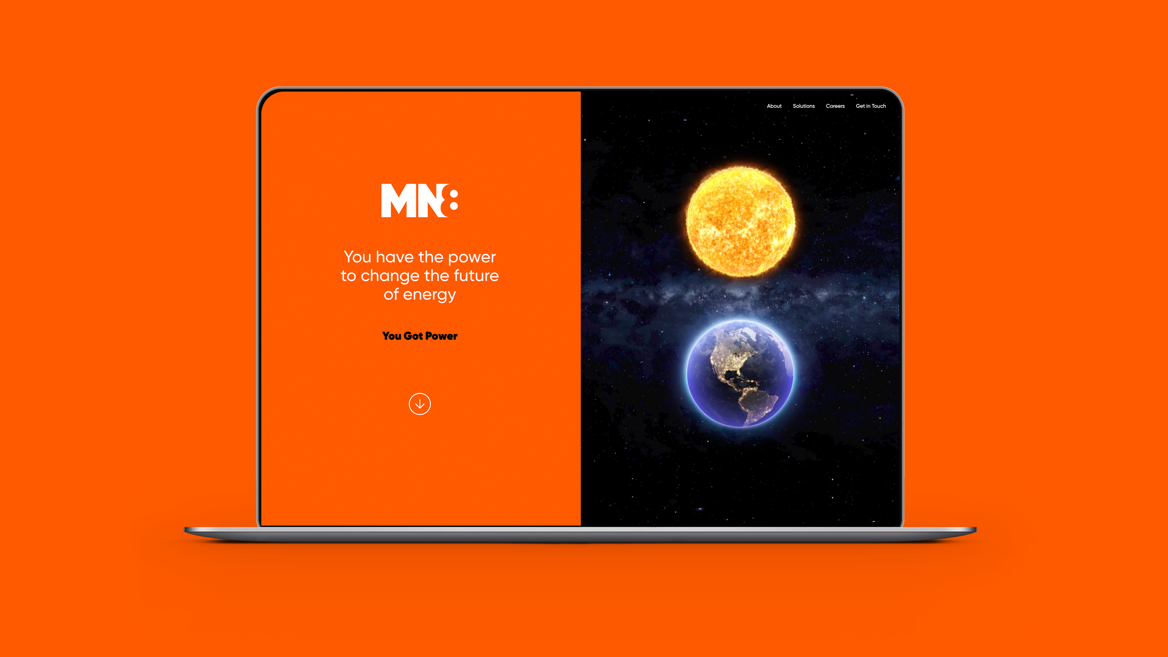
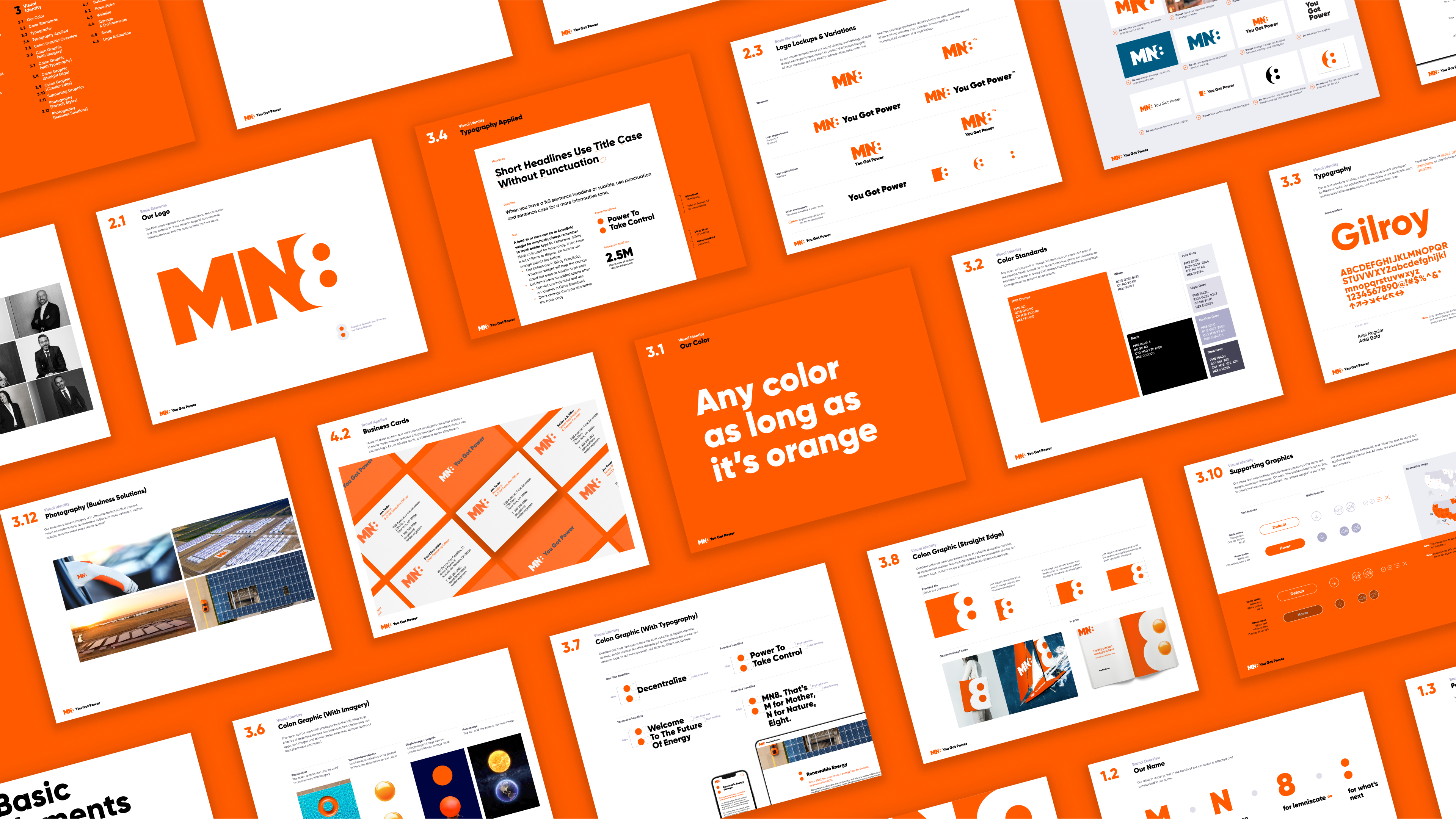
You got power
MN8 is the enterprise renewable energy company, relentlessly making energy smarter, cleaner, more accessible and more efficient. Goldman Sachs’s spin-out of its renewable energy business created a paradigm-shifting opportunity to put power – literally and metaphorically – in the hands of the customer.
The logo concept and “all orange everything” ideas were all Steve and Kat; the negative space 8/colon/power socket logo concept was a winner early on. I worked on naming, logo concepting, website design, design systems, and the guidelines.
Agency: Thackway McCord
Client: GOLDMAN SACHS & mn8 energy
Role: DESIGN, LOGO, MOTION, QA, ui/ux
executive Creative direction: kat mccord
design lead & creative direction: steve clarke
client services: lucinda quartararo
PROGRAMMING: dave morreale
Strategy: Simon Thackway, Jonathan Paisner


2023
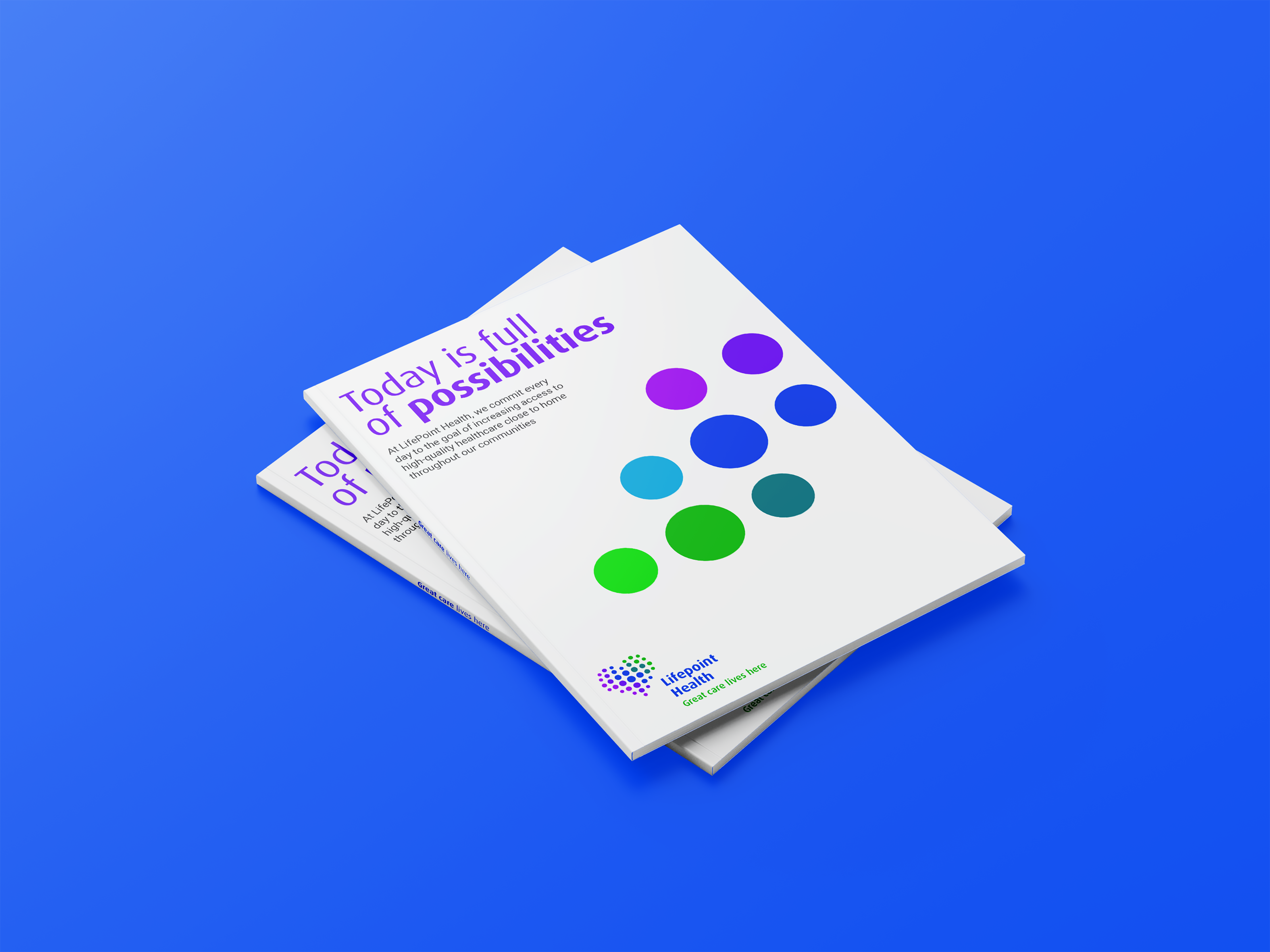
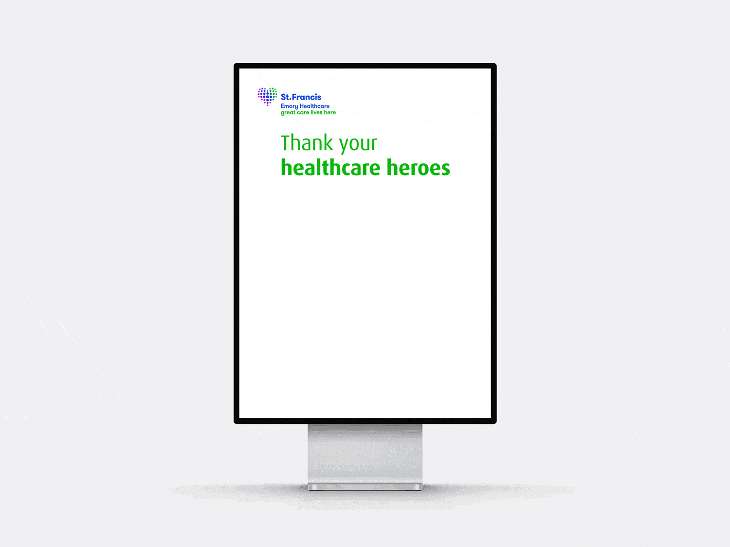
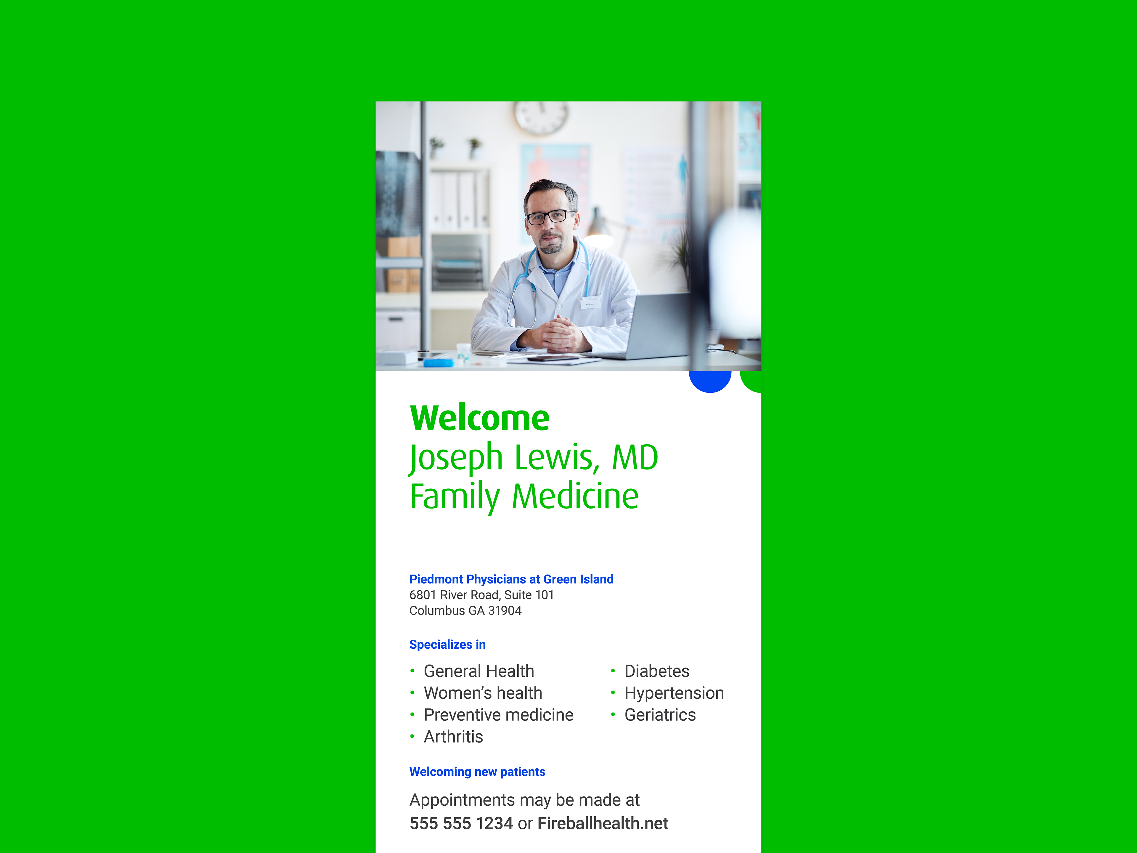
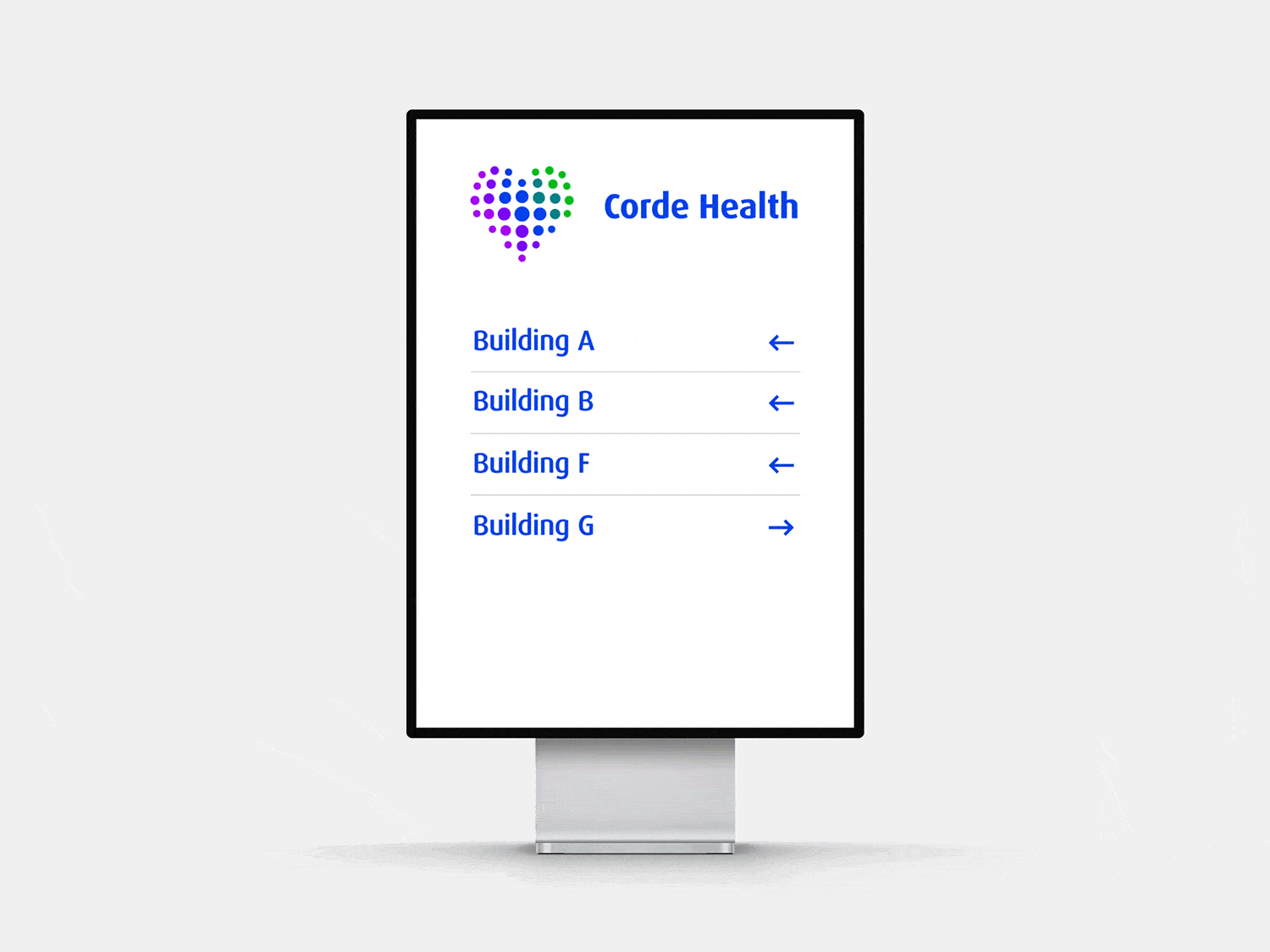
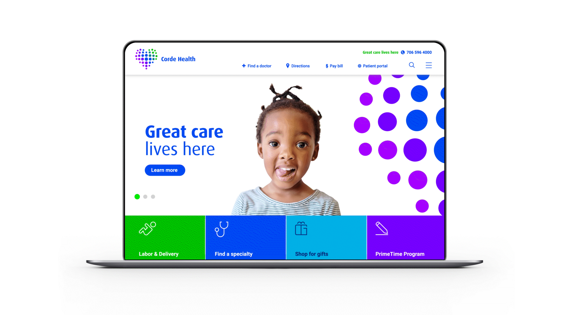
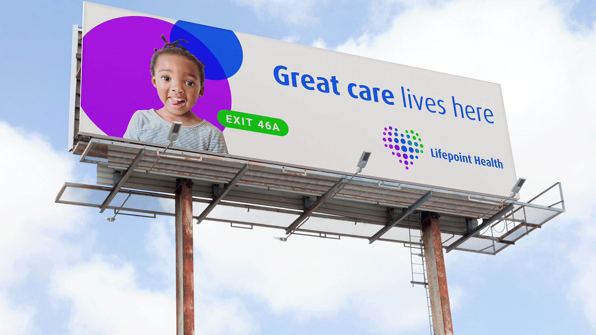
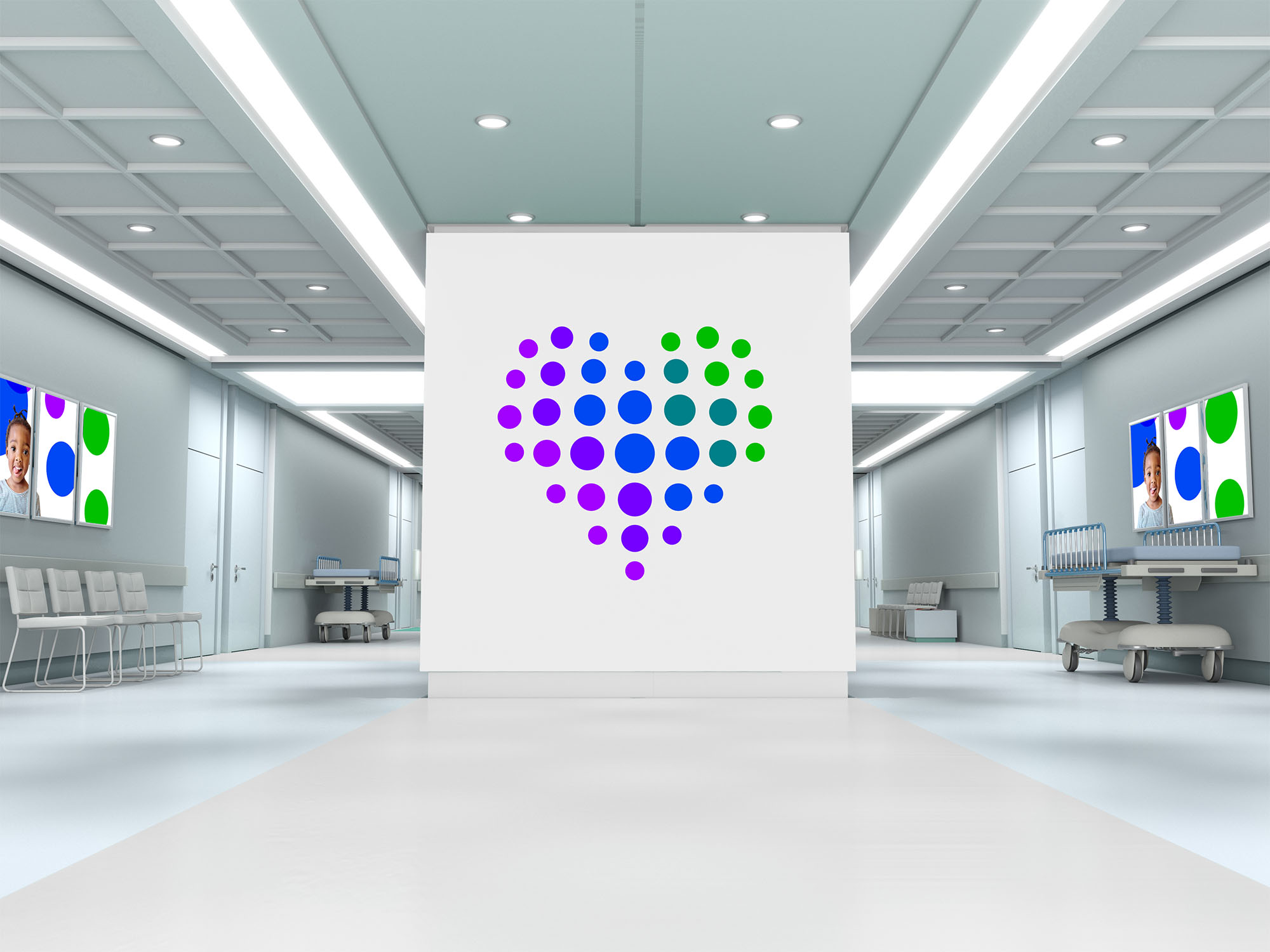
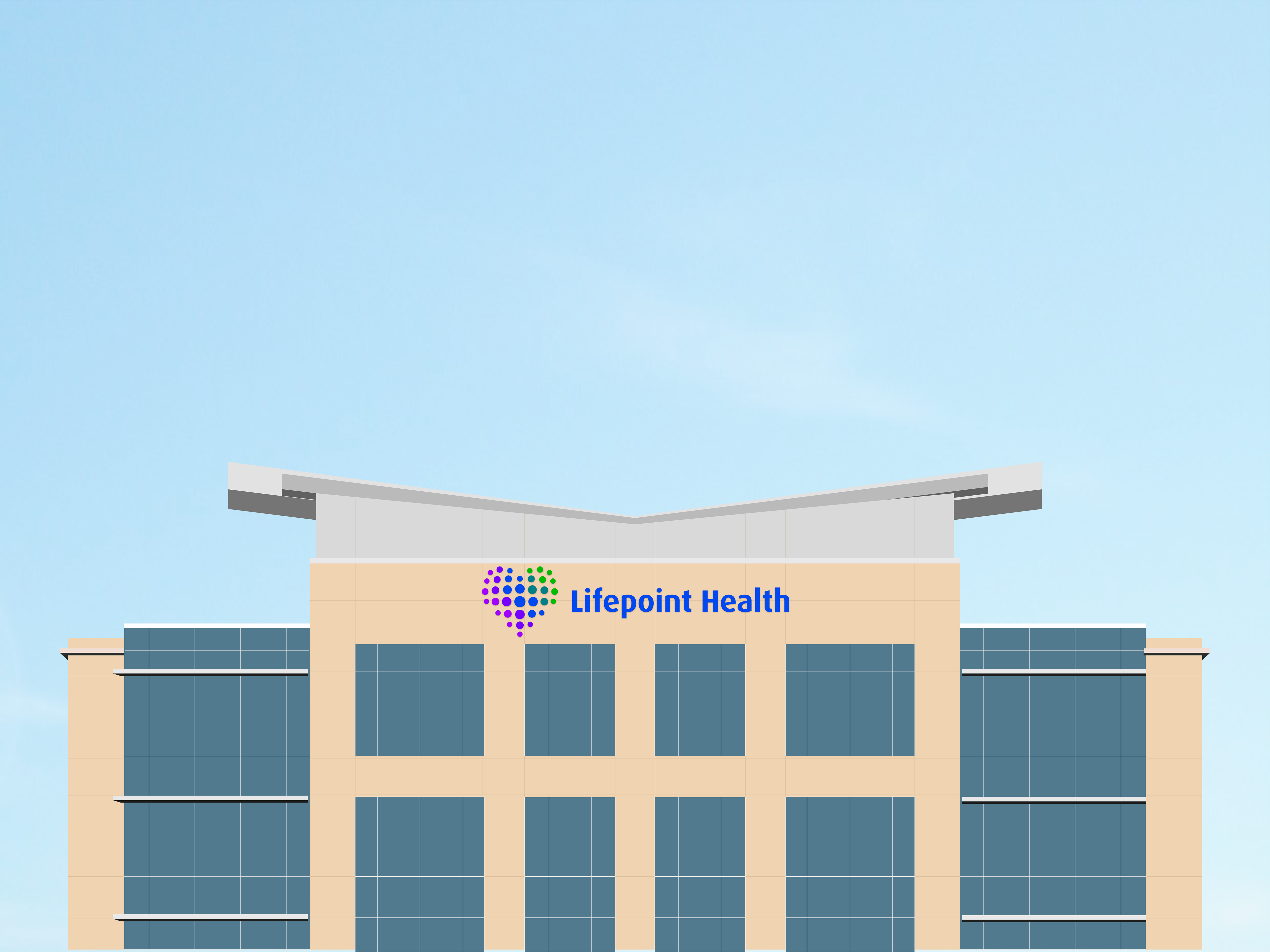
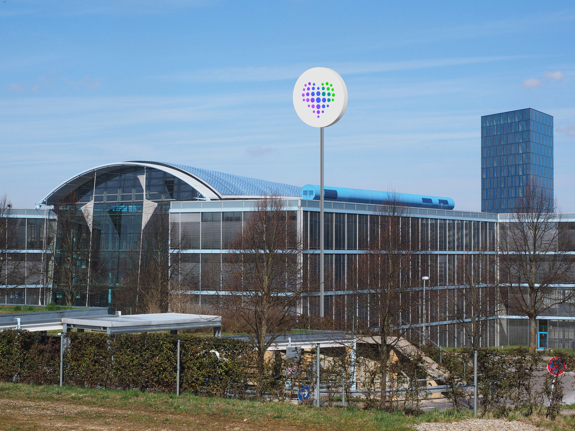
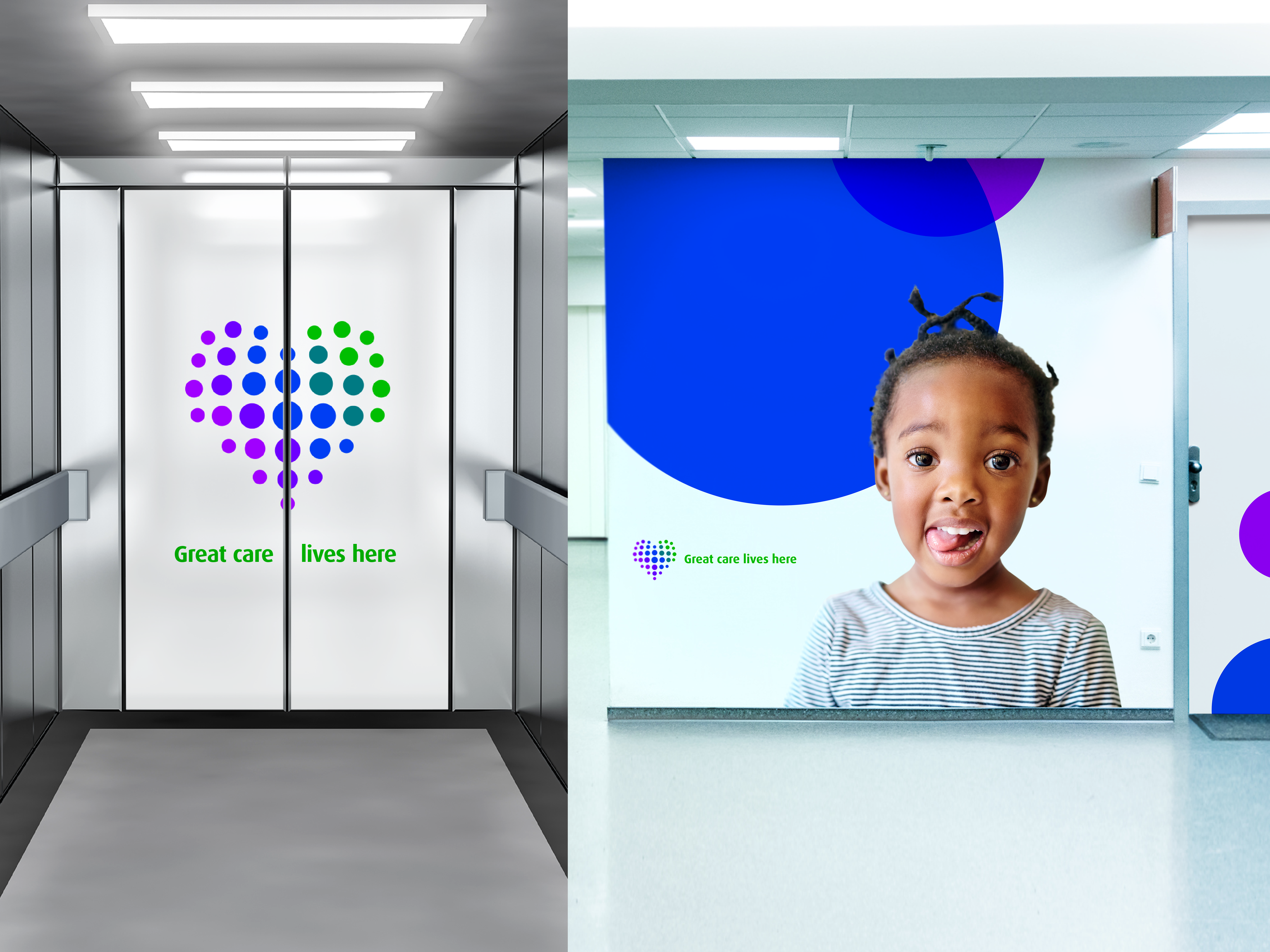
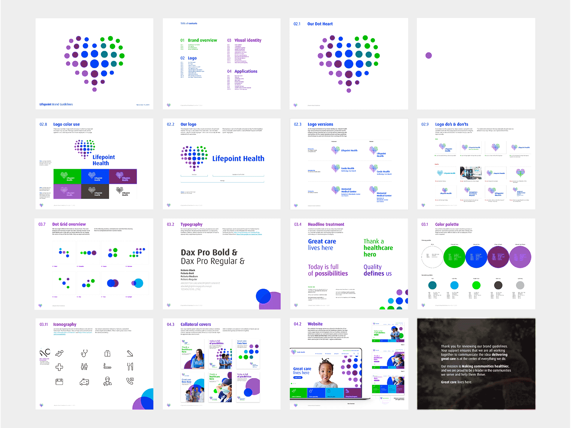
Great care lives here
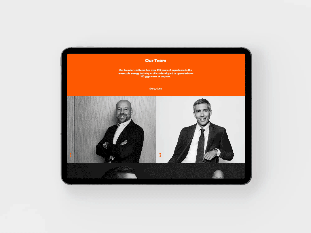
Lifepoint is a national for-profit healthcare provider, currently operating in 89 locations across the United States. The network is deeply connected within and committed to the communities it serves. In many of them, the hospital is as vital a part of community infrastructure as roads and schools.
The heart created the foundation for a visual identity system based on a palette of clean white and vibrant color, applied through a rigorously developed library of crop configurations originating from the dot motif.
Agency: Thackway McCord
Client: LIFEPOINT HEALTH
Role: DESIGN LEAD, LOGO, MOTION, ENVIRONMENTS, PRINT
Creative direction: kat mccord
DESIGN: BIANCA SEONG, FUCHEN KUANG
Strategy: Simon Thackway, Jonathan Paisner


2022
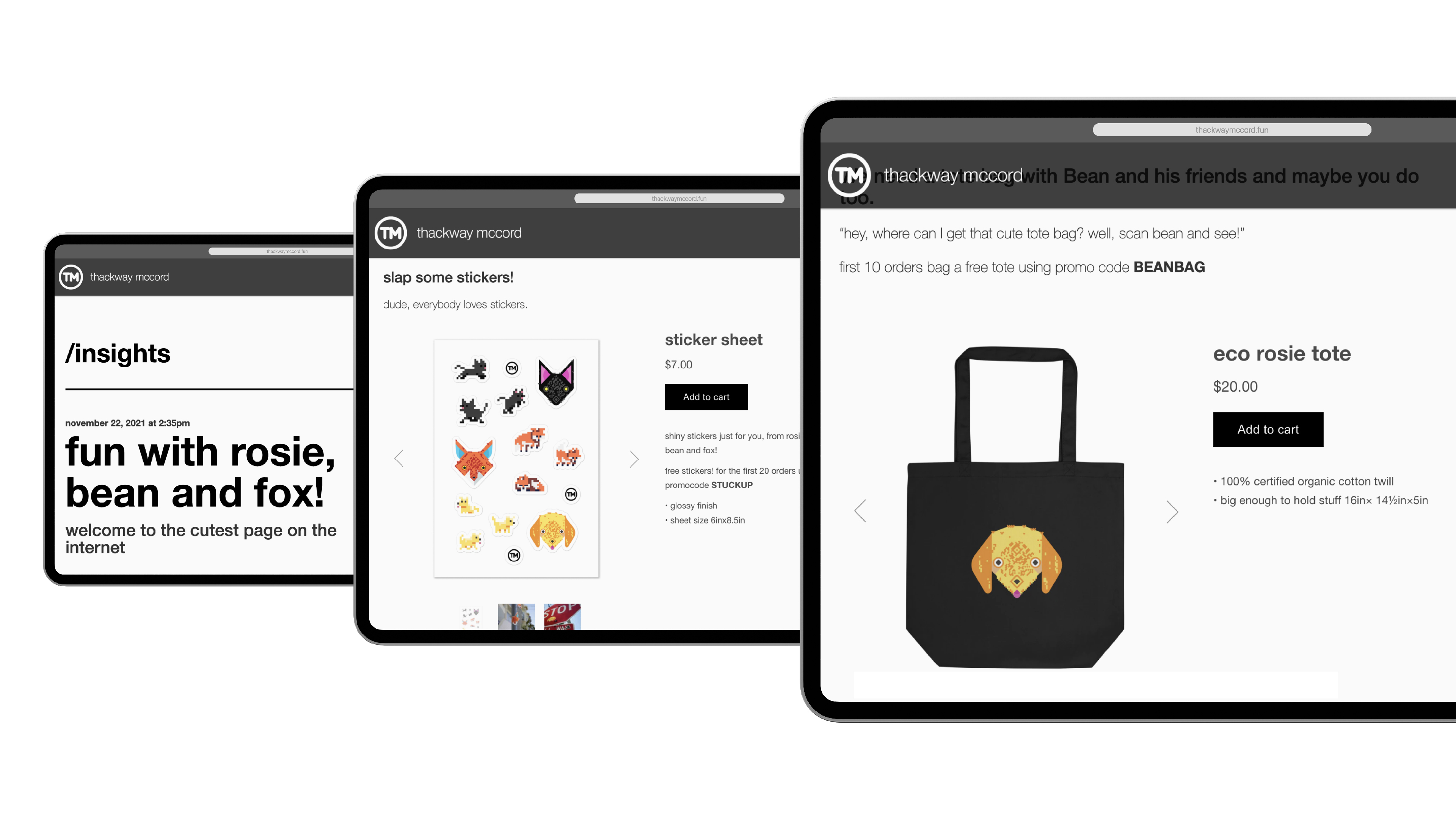
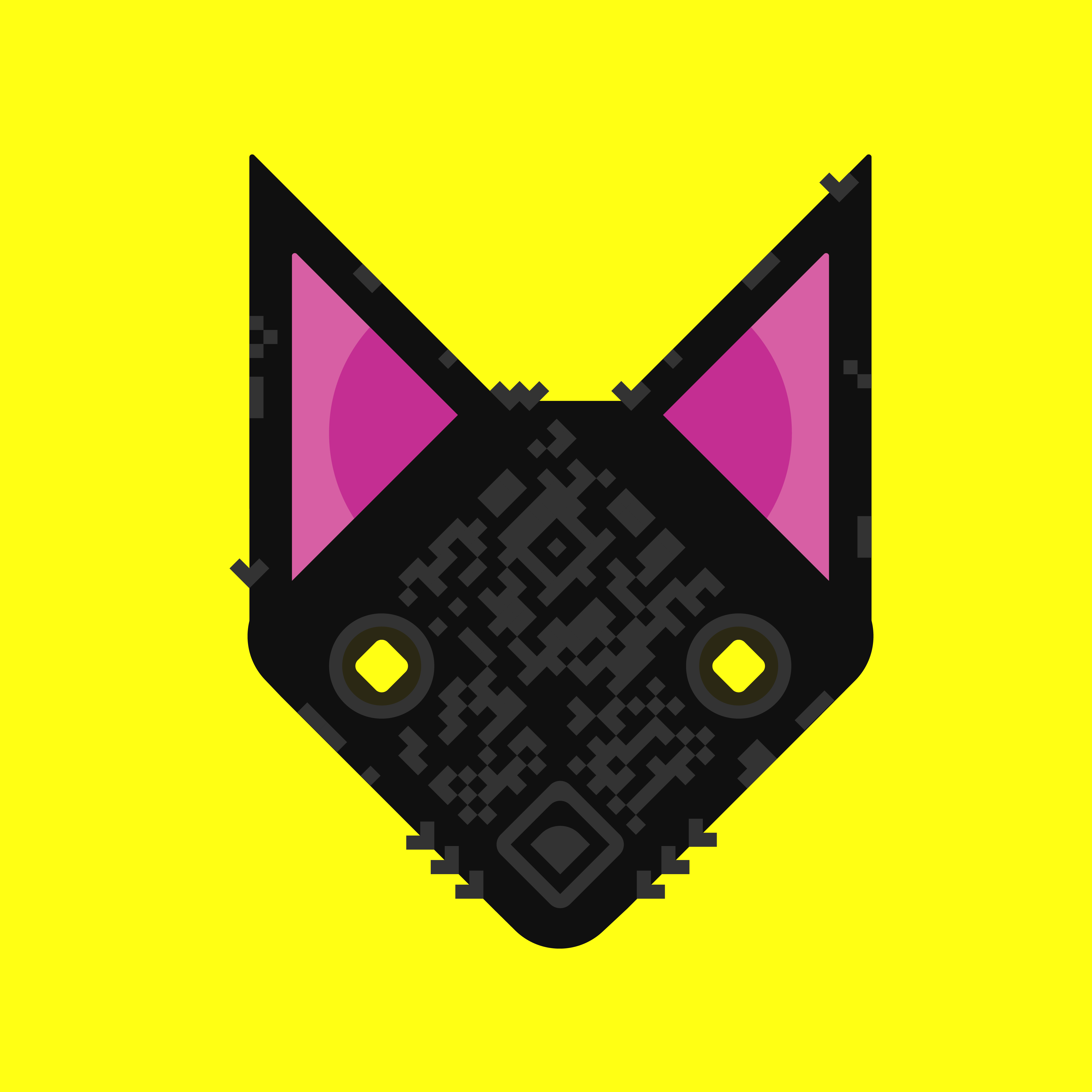
Making QR codes fun!
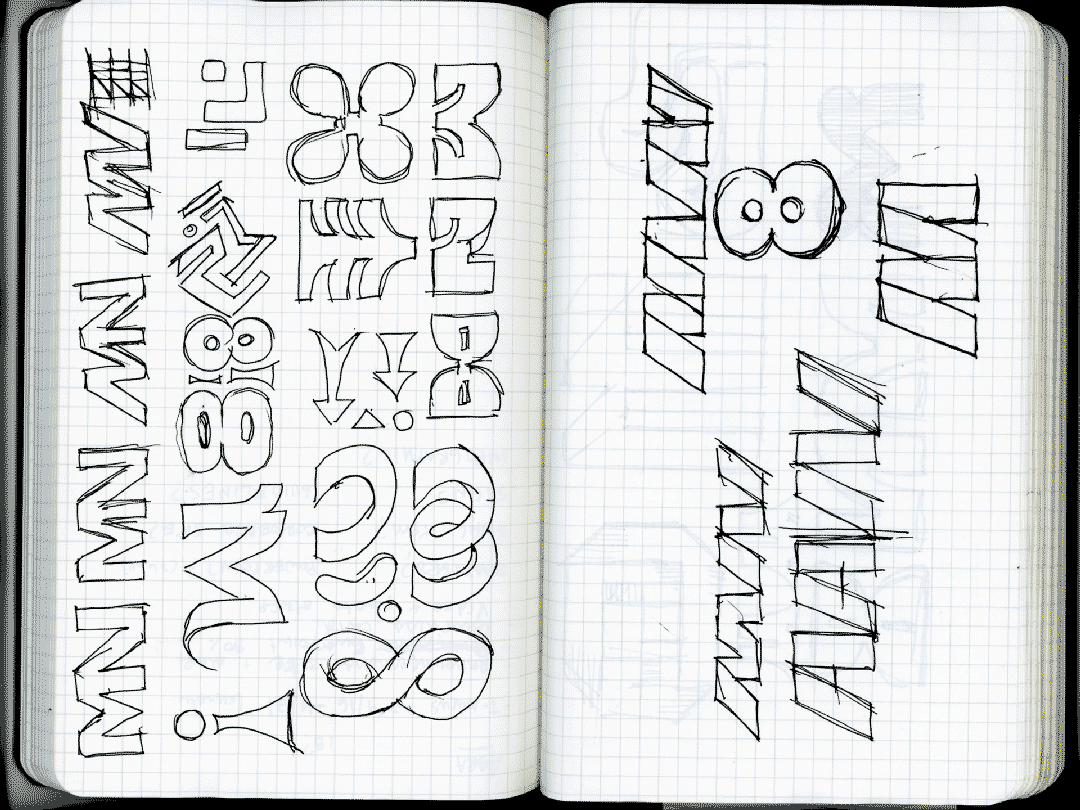
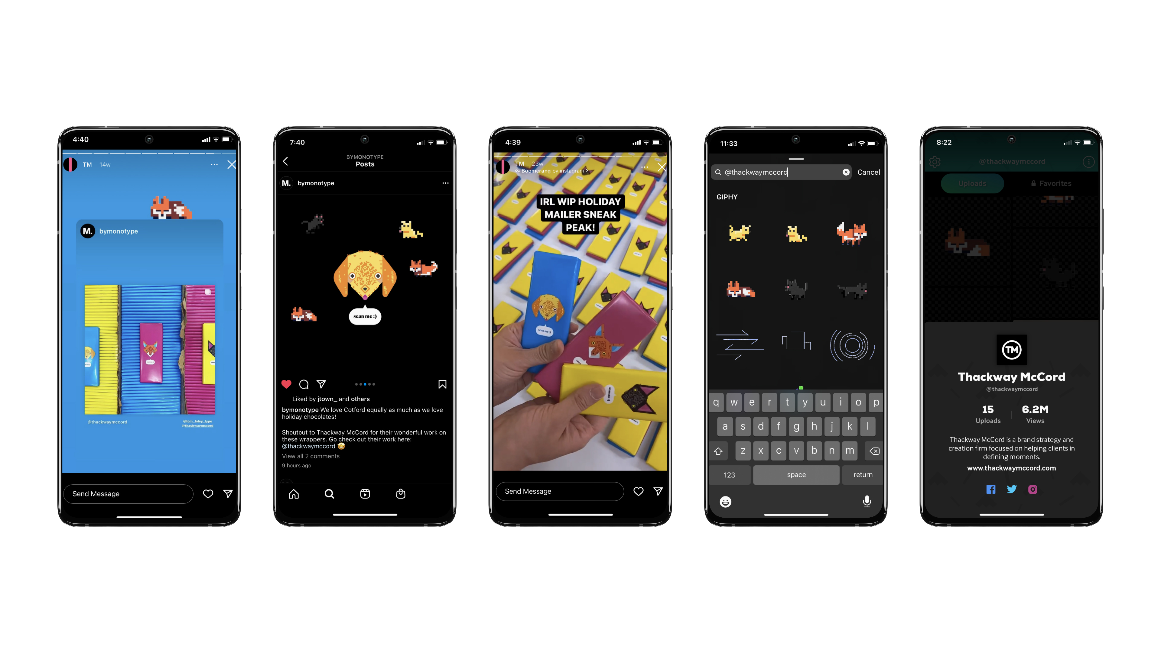
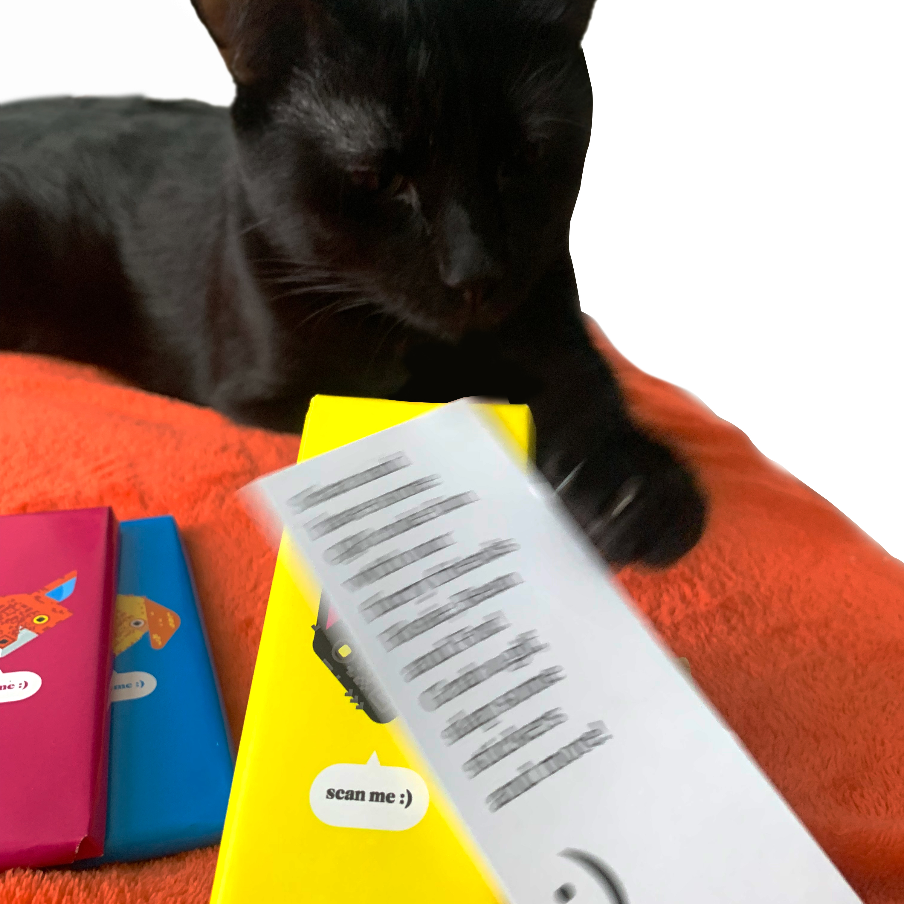
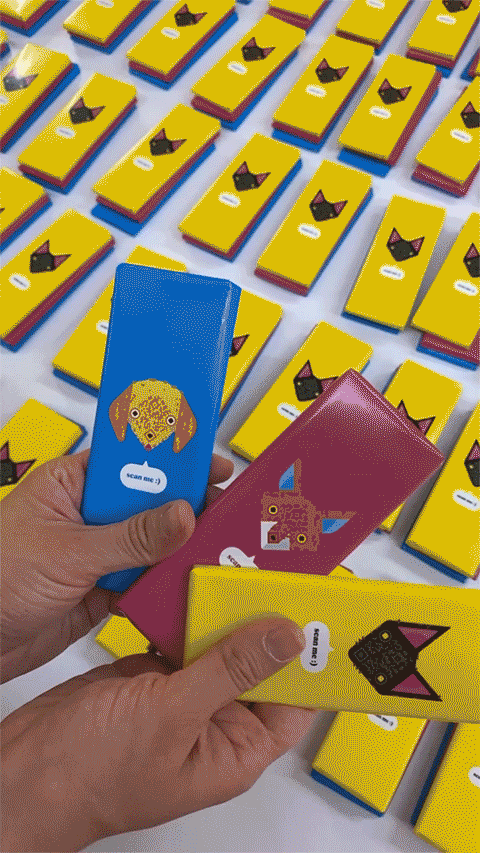
Every holiday season, Thackway McCord partners with an artist to create a series of chocolate bars to send as gifts. For 2021, I pitched the idea of drawing custom QR codes linking to some fun, TM-branded url. The pandemic had made the codes ubiqutous, but their most common use cases for a no-contact-on-demand-service felt like a missed opportunity.
What began as abstract drawings of QR codes (see 01, 02, 03 for examples) ended up as portraits of animals coupled with 8-bit style gifs and stickers with individual phrases and personalities that we were workshopping.
Monotype liked how we used Cotford against the glitchy, erratic look of the codes and sprite art. And then our silly gifs started getting popular on giphy by getting posted as stickers on instagram.
And finally, and most importantly, my cat starred in the case study alongside his illustration.
Agency: Thackway McCord
Role: ART DIRECTION, DESIGN lead, illustration, MOTION, PROGRAMMING, packaging, PROMO
LINK: thackwaymccord.fun
models: bean & rosie
creative direction: KAT MCCORD
🏆🏆🏆 AWARDS:
- COMMARTS ILLUSTRATION 2022 (SHORTLISTED)
- HIIIBRAND ILLUSTRATION 2022 (FINALIST)
- indigo awards 2022 digital (gold)


2022
Amrop brand refresh & website
🚧 case study in progress
Agency: Thackway McCord
Role: ART DIRECTION, DESIGN lead, illustration, MOTION, PROGRAMMING, interaction
LINK: https://www.amrop.com/
creative direction: KAT MCCORD