2024
You got power
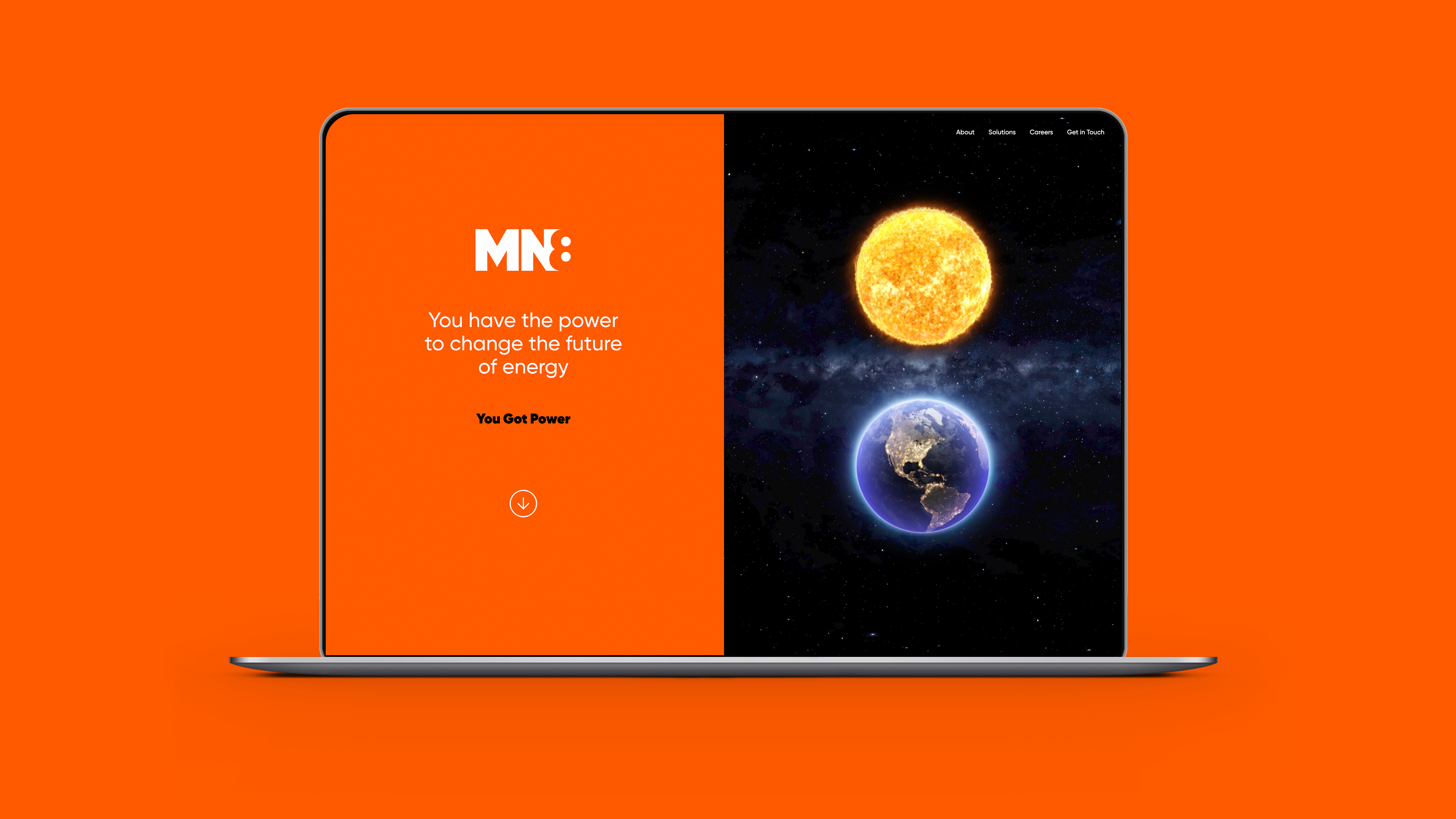
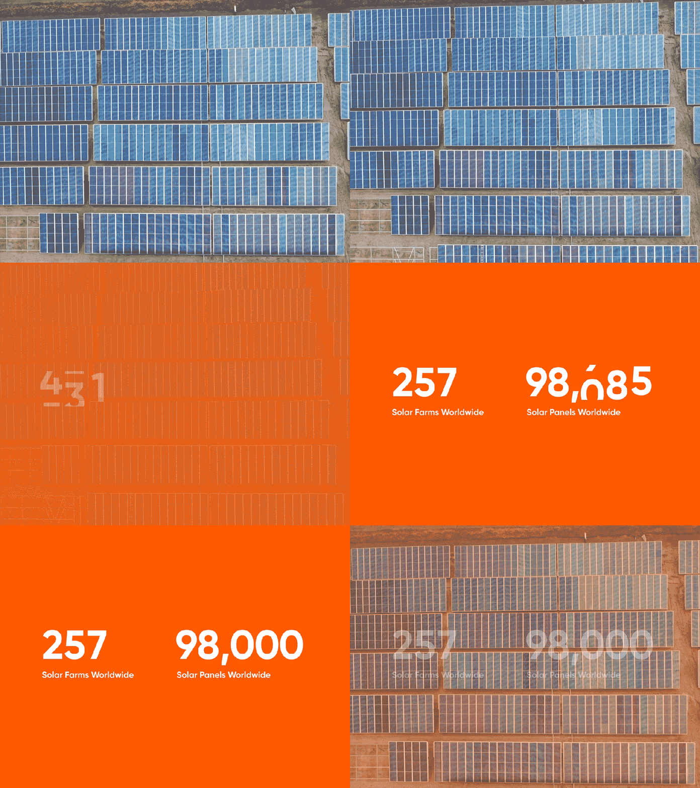
MN8 is the enterprise renewable energy company, relentlessly making energy smarter, cleaner, more accessible and more efficient. Goldman Sachs’s spin-out of its renewable energy business created a paradigm-shifting opportunity to put power – literally and metaphorically – in the hands of the customer.
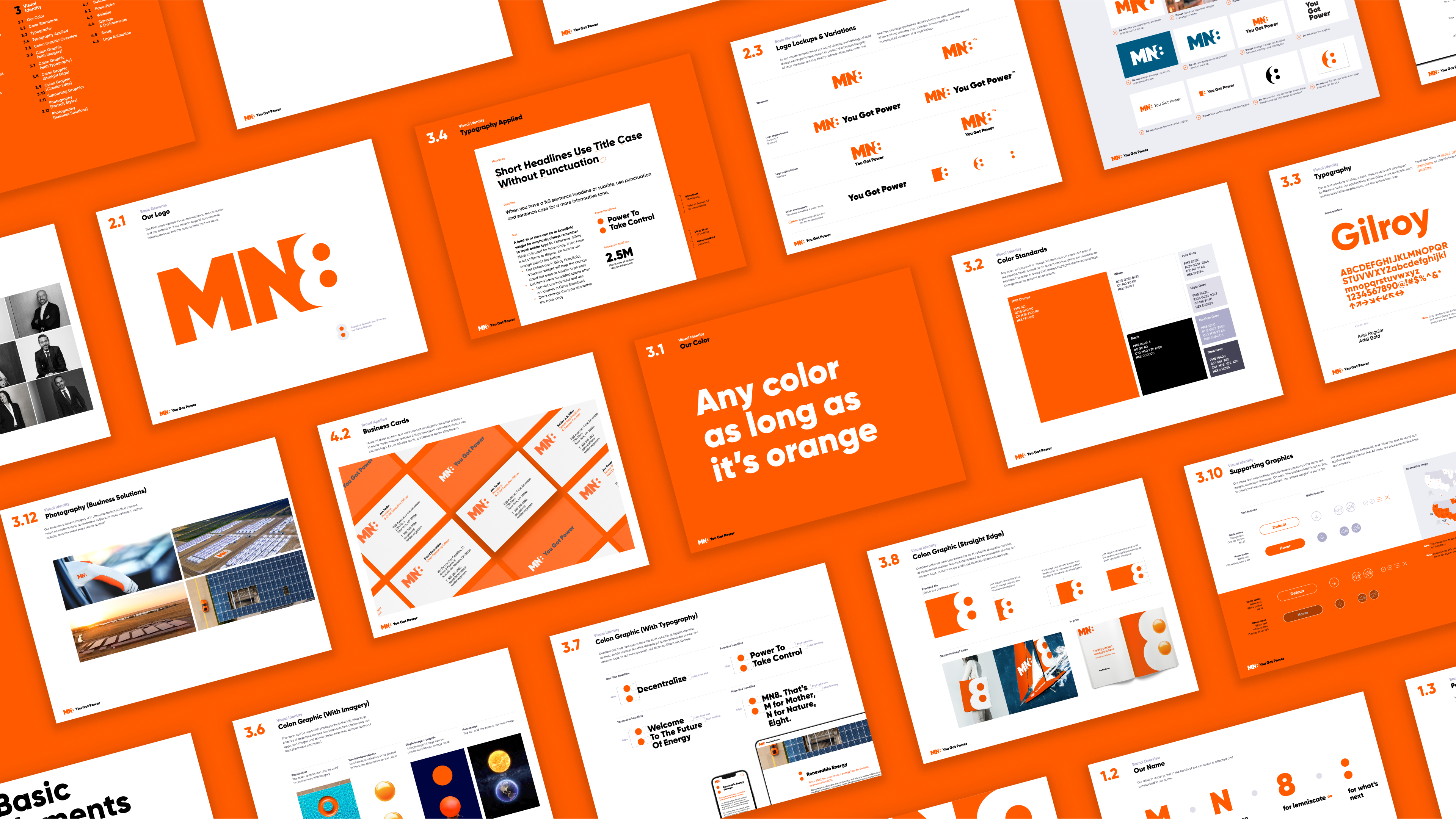
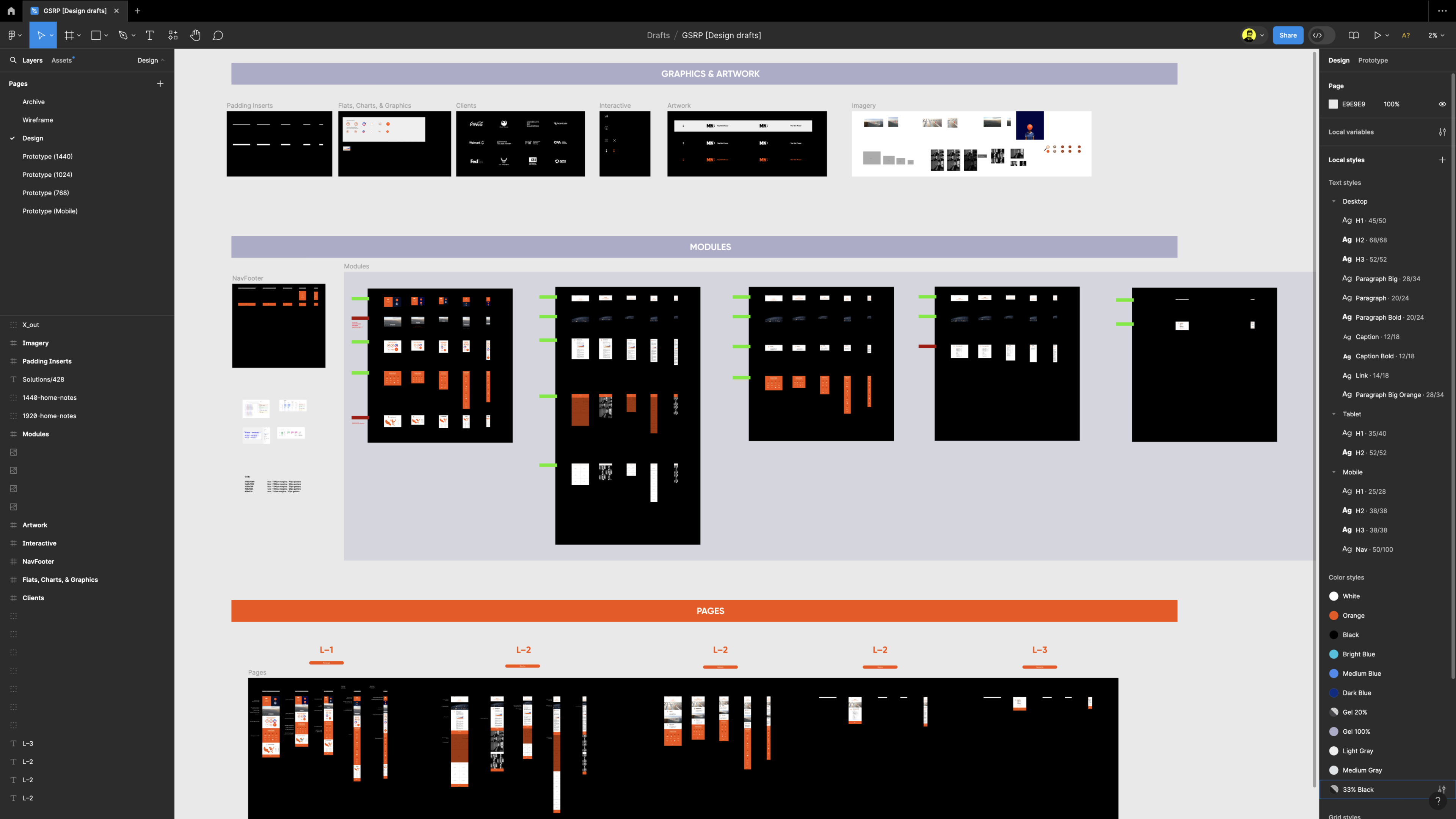
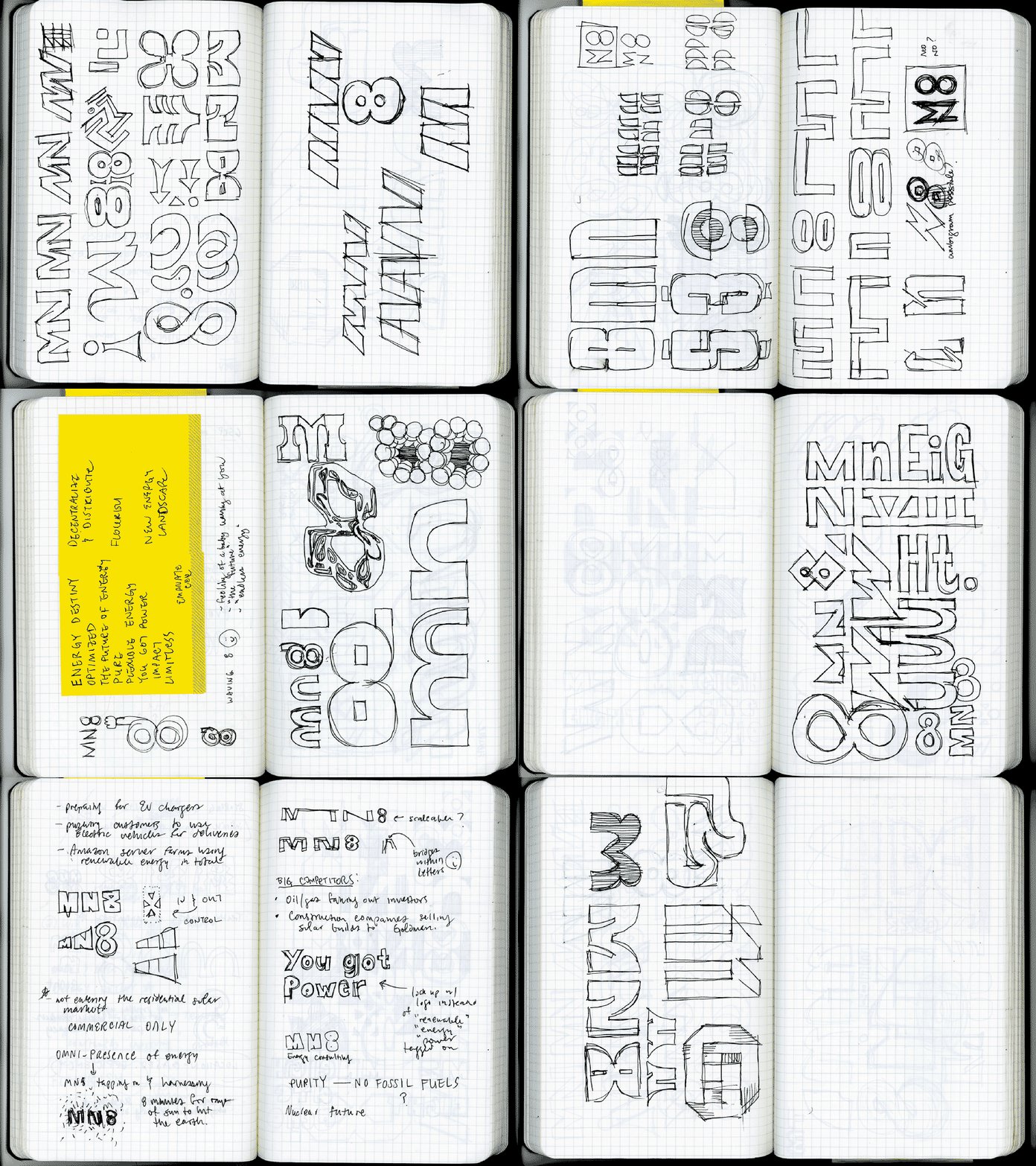
The logo concept and “all orange everything” ideas were all Steve and Kat; the negative space 8/colon/power socket logo concept was a winner early on. I worked on naming, logo concepting, website design, design systems, and the guidelines.
Agency: Thackway McCord
Client: GOLDMAN SACHS & mn8 energy
Role: DESIGN, LOGO, MOTION, QA, ui/ux
executive Creative direction: kat mccord
design lead & creative direction: steve clarke
client services: lucinda quartararo
PROGRAMMING: dave morreale
Strategy: Simon Thackway, Jonathan Paisner
