MN8 Energy
Enterprise renewable energy company rebranding from Goldman Sachs spin-off

MN8 Energy was established in 2022 as an independent entity following its spin-off from Goldman Sachs Renewable Power LLC. As a leading enterprise renewable energy company, MN8 is committed to making energy smarter, cleaner, more accessible, and more efficient. The company's portfolio includes approximately 4 GW of operational and under-construction solar projects, over 1.1 GWh of battery energy storage capacity, and a growing network of EV charging stations across the United States.
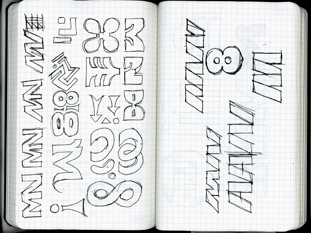
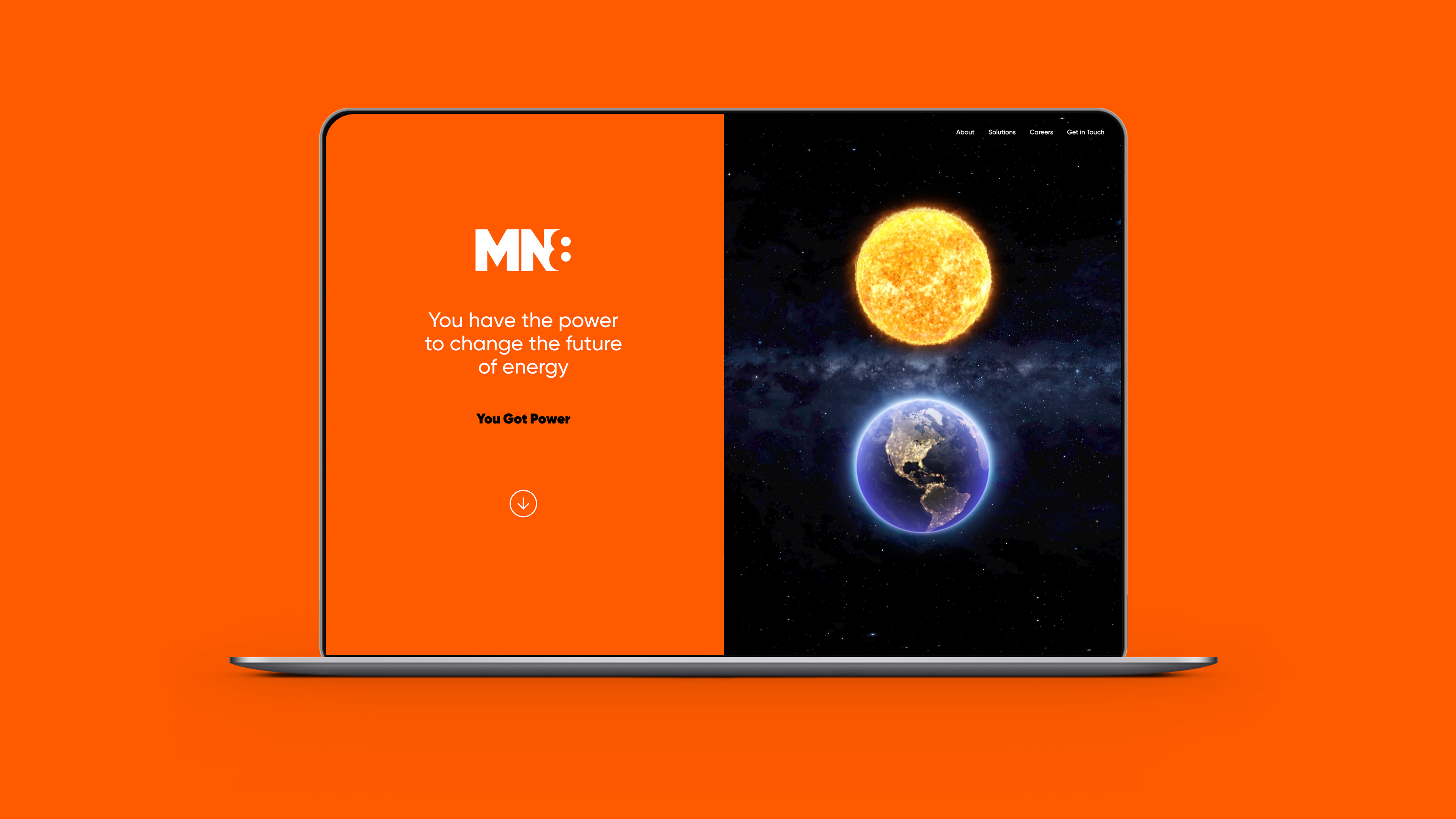
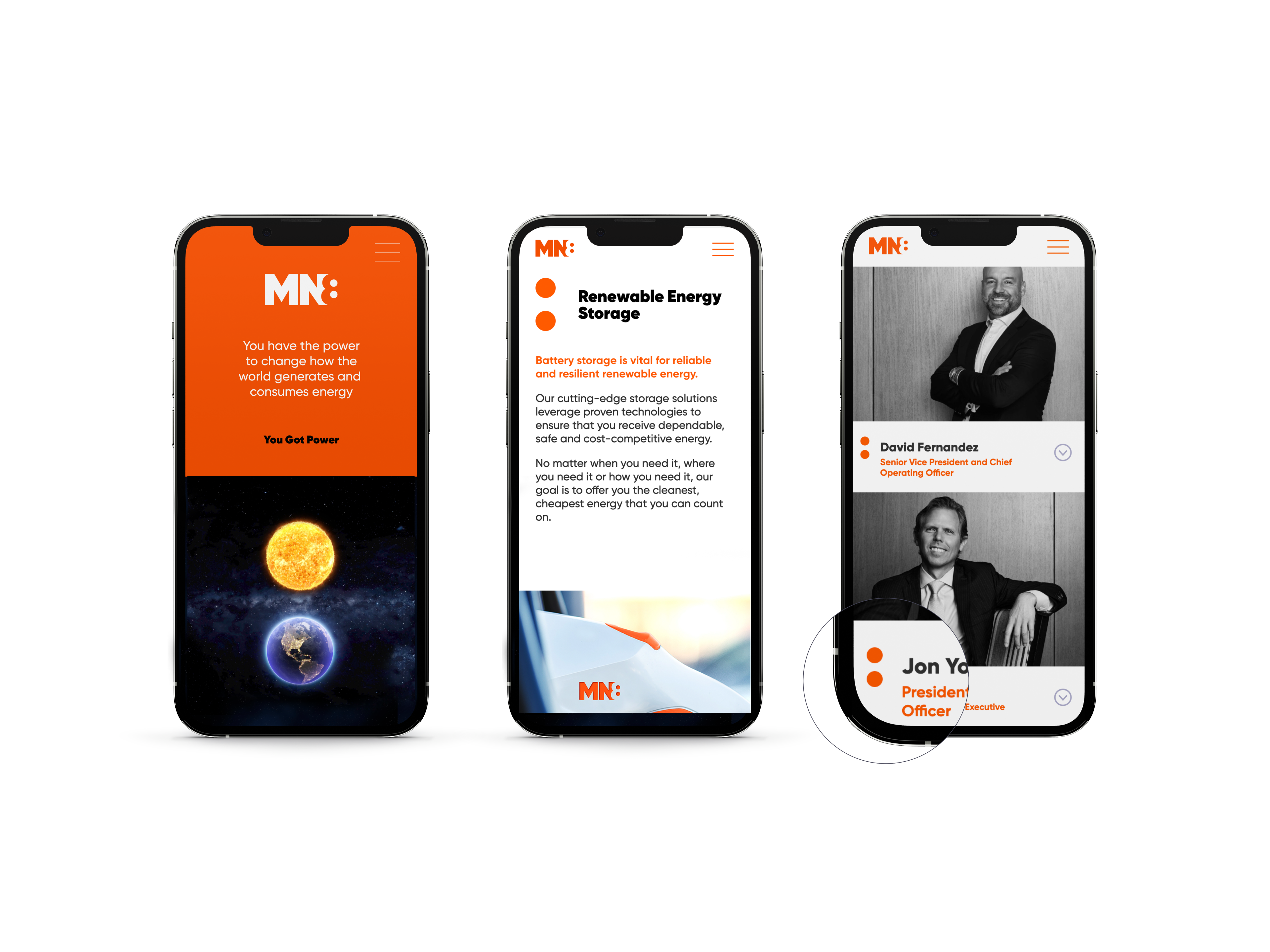
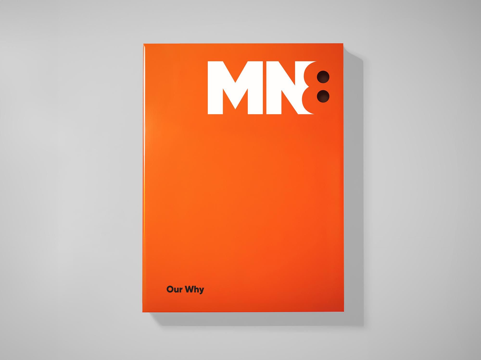
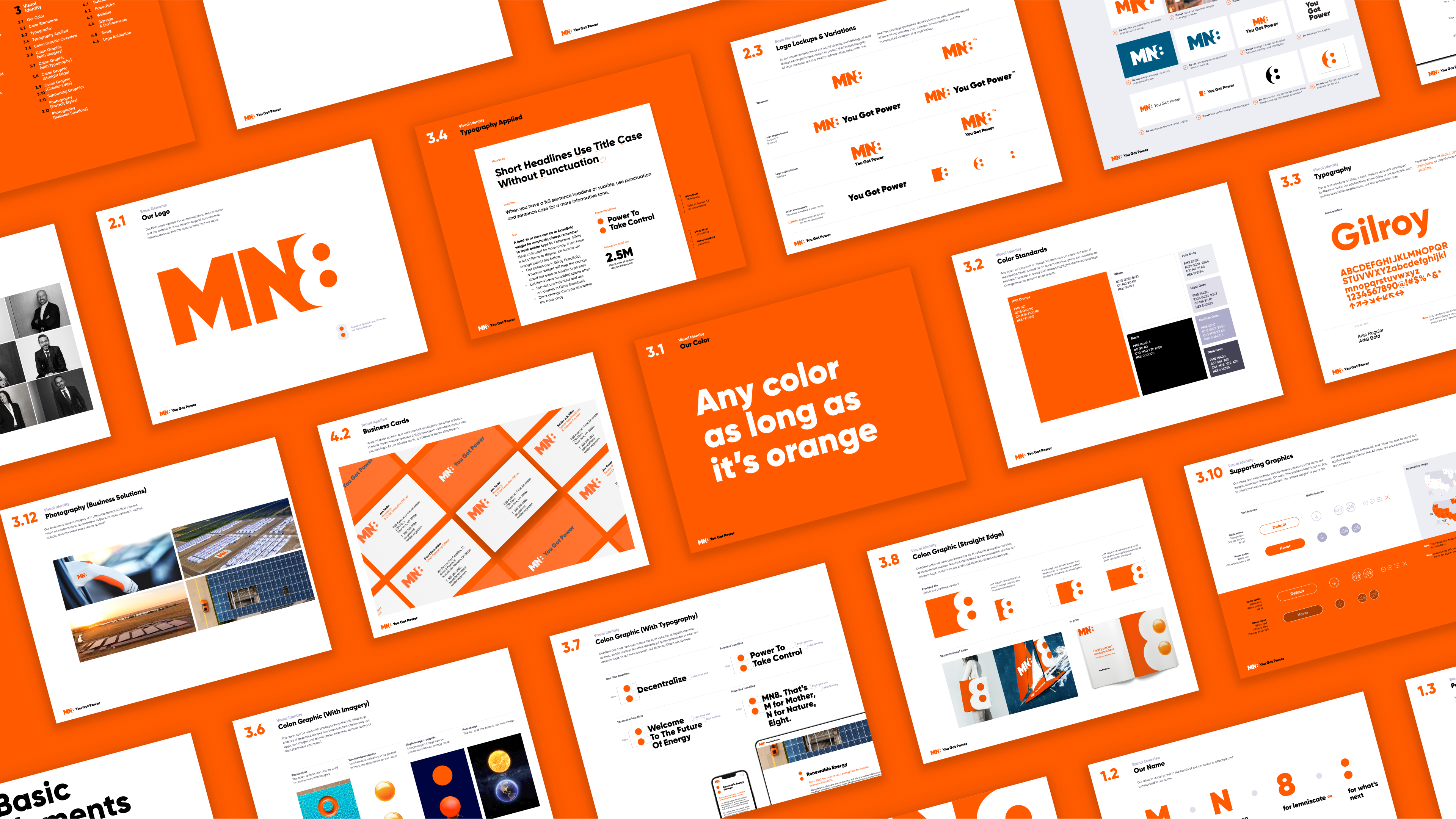
The name "MN8" (pronounced "emanate") symbolizes both the constant motion of energy and the company's innovative approach to power generation and distribution. The logo features a clever negative space design where the "8" doubles as both a colon and a power socket, visually communicating the company's core business of energy delivery. The bold, all-orange brand identity sets MN8 apart in an industry often dominated by conservative blue and green palettes.
I worked extensively on naming exploration, logo concepting, website design, design systems implementation, and brand guidelines development. My contributions helped translate the strategic vision into cohesive visual assets that positioned MN8 as a forward-thinking energy innovator.
Brand exploration & naming
Conducted collaborative naming workshops to develop a distinctive brand name that would resonate with both corporate clients and consumers. Explored numerous directions before finalizing MN8, which cleverly combines the concept of illumination with a modern, tech-forward sound.
Brand strategy development
Defined core brand values, positioning, and personality traits that would distinguish MN8 in the competitive energy landscape. Established a strategic framework that highlighted the company's commitment to innovation and sustainability without relying on category clichés.
Visual identity creation
Designed a comprehensive visual identity system including logo, typography, color palette, and graphic elements. Created a dynamic system that could flex across various touchpoints while maintaining a cohesive brand experience.
Digital experience design
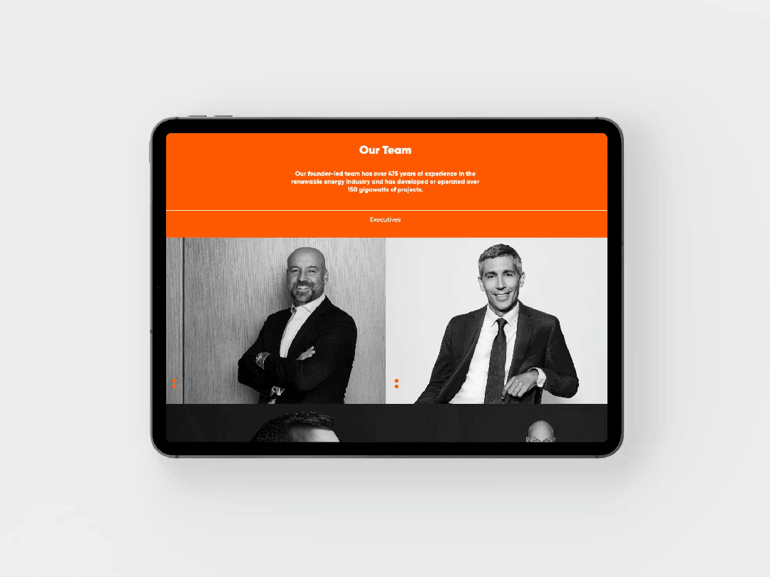
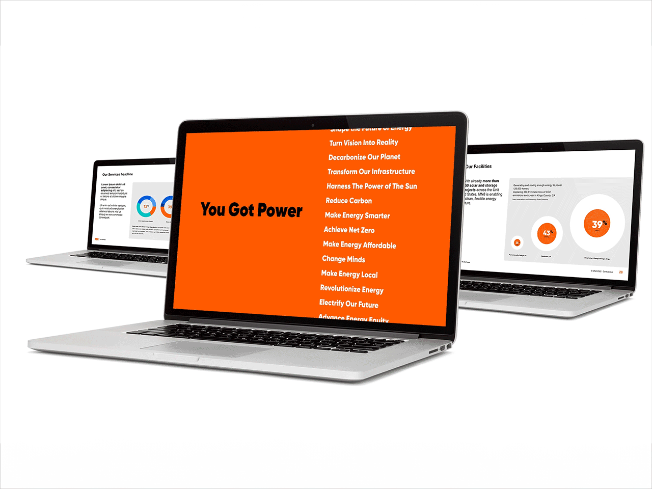
Developed website wireframes, UI design, and content strategy that effectively communicated complex energy solutions to diverse audiences. Created interactive elements that showcased MN8's technological capabilities and project portfolio.
Real-world applications
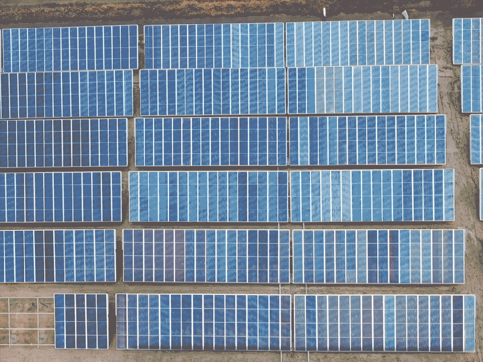
The brand comes to life across various touchpoints, from digital platforms to physical locations. MN8 Energy operates solar farms and EV charging stations across the country, with the brand designed to work effectively in these diverse environments.

Brand guidelines & assets
Produced comprehensive brand guidelines documenting all visual and verbal elements. Developed templates for presentations, reports, and marketing materials to ensure consistent application across the organization.
Launch & implementation
Coordinated the phased rollout of the new brand across all channels. Provided training and resources for internal teams to ensure adoption and proper implementation of brand standards.
Design process & collaboration
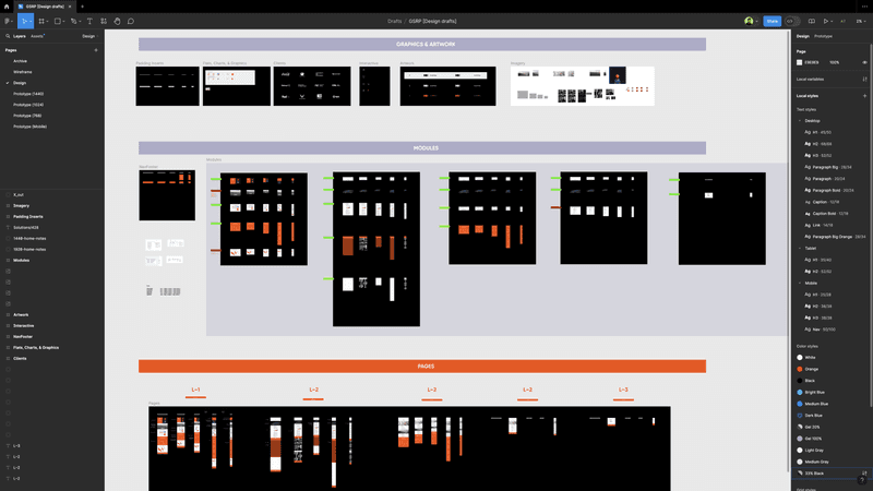
As design, logo, motion, and UI/UX lead, I worked closely with the creative team to iterate on concepts, refine the design system, and ensure all deliverables met both aesthetic and functional requirements. We used Figma for collaborative design work and stakeholder presentations.
Agency credits
Client: Goldman Sachs & MN8 Energy
Agency: Thackway McCord
Role: Design, Logo, Motion, QA, UI/UX
Executive Creative Direction: Kat McCord
Design Lead & Creative Direction: Steve Clarke
Client Services: Lucinda Quartararo
Programming: Dave Morreale
Strategy: Simon Thackway, Jonathan Paisner